Avatar Header
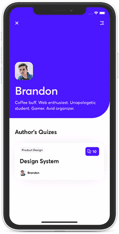
Example usage
Check out AvatarHeader examples for ScrollView, FlatList, SectionList & FlashList
const AvatarHeaderScrollViewExample: React.FC = () => {
  const navigation = useNavigation();

  function goBack() {
    navigation.goBack();
  }

  const isDarkTheme = useColorScheme() === 'dark';

  return (
    <>
      <AvatarHeaderScrollView
        leftTopIcon={iconCloseWhite}
        leftTopIconOnPress={goBack}
        rightTopIcon={IconMenu}
        contentContainerStyle={[
          isDarkTheme ? screenStyles.darkBackground : screenStyles.lightBackground,
        ]}
        containerStyle={screenStyles.stretchContainer}
        backgroundColor={Brandon.color}
        hasBorderRadius
        image={Brandon.image}
        subtitle={Brandon.about}
        title={Brandon.author}
        titleStyle={screenStyles.text}
        showsVerticalScrollIndicator={false}>
        <View style={styles.content}>
          {Brandon.cards.map((data, i, arr) => (
            <QuizCard data={data} num={i} key={data.question} cardsAmount={arr.length} />
          ))}
        </View>
      </AvatarHeaderScrollView>
      <StatusBar barStyle="light-content" backgroundColor={Brandon.color} translucent />
    </>
  );
};
Props
AvatarHeaderScrollView props
Inherits ScrollViewProps and Shared AvatarHeader props
AvatarHeaderFlatList props
Inherits FlatListProps and Shared AvatarHeader props
AvatarHeaderFlatList props
Inherits SectionListProps and Shared AvatarHeader props
Shared AvatarHeader props
| Prop | Type | Default value |
|---|---|---|
| backgroundColor | color - ColorValue | - |
| backgroundImage | image source - ImageSourcePropType | - |
| containerStyle | style - StyleProp<ViewStyle> | - |
| enableSafeAreaTopInset | boolean | true |
| leftTopIcon | render function or image source | - |
| leftTopIconAccessibilityLabel | string | - |
| leftTopIconOnPress | function - () => void | - |
| leftTopIconTestID | string | - |
| hasBorderRadius | boolean | - |
| headerHeight | number | 100 |
| image | image source - ImageSourcePropType | - |
| onHeaderLayout | function - (e: LayoutChangeEvent) => void | - |
| onMomentumScrollBegin | worklet function - (e: NativeScrollEvent) => void | - |
| onMomentumScrollEnd | worklet function - (e: NativeScrollEvent) => void | - |
| onScroll | worklet function - (e: NativeScrollEvent) => void | - |
| onScrollBeginDrag | worklet function - (e: NativeScrollEvent) => void | - |
| onScrollEndDrag | worklet function - (e: NativeScrollEvent) => void | - |
| onTabsLayout | function - (e: LayoutChangeEvent) => void | - |
| onTopReached | function - () => void | - |
| parallaxHeight | number | 53% of screen's height |
| renderHeaderBar | render function | - |
| rightTopIcon | render function or image source | - |
| rightTopIconAccessibilityLabel | string | - |
| rightTopIconOnPress | function - () => void | - |
| rightTopIconTestID | string | - |
| snapStartThreshold | number | - |
| snapStopThreshold | number | - |
| snapToEdge | boolean | true |
| stickyTabs | boolean | true |
| subtitle | string | - |
| subtitleStyle | style - StyleProp<TextStyle> | - |
| subtitleTestID | string | - |
| tabsContainerBackgroundColor | color - ColorValue | - |
| title | string | - |
| titleStyle | style - StyleProp<TextStyle> | - |
| titleTestID | string | - |