Tabbed Header List
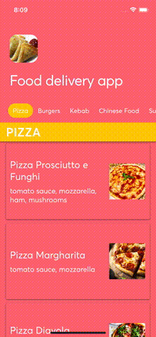
Example usage
Full source code can be found in example repo.
const TabbedHeaderListExample: React.FC = () => {
  return (
    <>
      <TabbedHeaderList
        contentContainerStyle={{ backgroundColor: colors.coralPink }}
        containerStyle={screenStyles.stretchContainer}
        backgroundColor={colors.coralPink}
        title="Food delivery app"
        titleStyle={screenStyles.text}
        foregroundImage={{ uri: 'https://foodish-api.herokuapp.com/images/samosa/samosa9.jpg' }}
        parallaxHeight={100}
        tabs={TABBED_SECTIONS.map(({ title }) => ({ title }))}
        tabTextStyle={screenStyles.text}
        sections={TABBED_SECTIONS}
        tabTextContainerActiveStyle={{ backgroundColor: colors.activeOrange }}
        keyExtractor={(_, i) => `${i}`}
        renderItem={({ item }) => <TabbedSectionItem {...item} />}
        renderSectionHeader={({ section }) => (
          <TabbedSectionHeader title={section.title} />
        )}
        getItemLayout={(_, index) => ({
          length: TABBED_SECTION_ITEM_HEIGHT,
          offset: TABBED_SECTION_ITEM_HEIGHT * index,
          index,
        })}
        updateCellsBatchingPeriod={100}
        showsVerticalScrollIndicator={false}
      />
      <StatusBar barStyle="light-content" backgroundColor={colors.coralPink} translucent />
    </>
  );
};
Props
Inherits SectionListProps
| Prop | Type | Default value |
|---|---|---|
| backgroundColor | color - ColorValue | - |
| backgroundImage | image source - ImageSourcePropType | - |
| containerStyle | style - StyleProp<ViewStyle> | - |
| enableSafeAreaTopInset | boolean | true |
| foregroundImage | image source - ImageSourcePropType | - |
| hasBorderRadius | boolean | - |
| headerHeight | number | 100 |
| logo | image source - ImageSourcePropType | - |
| logoContainerStyle | style - StyleProp<ViewStyle> | - |
| logoResizeMode | image resize mode - ImageResizeMode | - |
| logoStyle | style - StyleProp<ImageStyle> | - |
| onHeaderLayout | function - (e: LayoutChangeEvent) => void | - |
| onMomentumScrollBegin | worklet function - (e: NativeScrollEvent) => void | - |
| onMomentumScrollEnd | worklet function - (e: NativeScrollEvent) => void | - |
| onScroll | worklet function - (e: NativeScrollEvent) => void | - |
| onScrollBeginDrag | worklet function - (e: NativeScrollEvent) => void | - |
| onScrollEndDrag | worklet function - (e: NativeScrollEvent) => void | - |
| onTabsLayout | function - (e: LayoutChangeEvent) => void | - |
| onTopReached | function - () => void | - |
| parallaxHeight | number | 53% of screen's height |
| renderHeaderBar | render function | - |
| snapStartThreshold | number | - |
| snapStopThreshold | number | - |
| snapToEdge | boolean | true |
| stickyTabs | boolean | true |
| tabTextActiveStyle | style - StyleProp<TextStyle> | - |
| tabTextContainerStyle | style - StyleProp<ViewStyle> | - |
| tabTextContainerActiveStyle | style - StyleProp<ViewStyle> | - |
| tabTextStyle | style - StyleProp<TextStyle> | - |
| tabUnderlineColor | color - ColorValue | - |
| tabWrapperStyle | style - StyleProp<ViewStyle> | - |
| tabs | Tabs array - Tab[] | - |
| tabsContainerBackgroundColor | color - ColorValue | - |
| tabsContainerHorizontalPadding | number | 20 |
| tabsContainerStyle | style - StyleProp<ViewStyle> | - |
| title | string | - |
| titleStyle | style = StyleProp<TextStyle> | - |
| titleTestID | string | - |
Tab
| Prop | Type | Default value |
|---|---|---|
| title | string | - |
| icon | React Element or render function with isActive param | - |