Tabbed Header Pager
Example usage
Full source code can be found in example repo.
const TabbedHeaderPagerExample: React.FC = () => {
const isDarkTheme = useColorScheme() === 'dark';
return (
<>
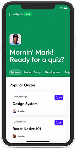
<TabbedHeaderPager
contentContainerStyle={[
isDarkTheme ? screenStyles.darkBackground : screenStyles.lightBackground,
]}
containerStyle={screenStyles.stretchContainer}
backgroundColor={colors.primaryGreen}
foregroundImage={photosPortraitMe}
rememberTabScrollPosition
logo={logo}
title={"Mornin' Mark! \nReady for a quiz?"}
titleStyle={screenStyles.text}
tabs={TABBED_SECTIONS.map((section) => ({
title: section.title,
}))}
tabTextStyle={screenStyles.text}
showsVerticalScrollIndicator={false}>
<View style={styles.content}>
{Brandon.cards.map((data, i, arr) => (
<QuizCard data={data} num={i} key={data.question} cardsAmount={arr.length} />
))}
</View>
<View style={styles.content}>
{Ewa.cards.map((data, i, arr) => (
<QuizCard data={data} num={i} key={data.question} cardsAmount={arr.length} />
))}
</View>
<View style={styles.content}>
{Jennifer.cards.map((data, i, arr) => (
<QuizCard data={data} num={i} key={data.question} cardsAmount={arr.length} />
))}
</View>
<View style={styles.content}>
{Brandon.cards.map((data, i, arr) => (
<QuizCard data={data} num={i} key={data.question} cardsAmount={arr.length} />
))}
</View>
<View style={styles.content}>
{Ewa.cards.map((data, i, arr) => (
<QuizCard data={data} num={i} key={data.question} cardsAmount={arr.length} />
))}
</View>
<View style={styles.content}>
{Jennifer.cards.map((data, i, arr) => (
<QuizCard data={data} num={i} key={data.question} cardsAmount={arr.length} />
))}
</View>
</TabbedHeaderPager>
<StatusBar barStyle="light-content" backgroundColor={colors.primaryGreen} translucent />
</>
);
};
Props
Inherits ScrollViewProps
| Prop | Type | Default value |
|---|---|---|
| backgroundColor | color - ColorValue | - |
| backgroundImage | image source - ImageSourcePropType | - |
| containerStyle | style - StyleProp<ViewStyle> | - |
| disableScrollToPosition | boolean | - |
| enableSafeAreaTopInset | boolean | true |
| foregroundImage | image source - ImageSourcePropType | - |
| hasBorderRadius | boolean | - |
| headerHeight | number | 100 |
| initialPage | number | 0 |
| logo | image source - ImageSourcePropType | - |
| logoContainerStyle | style - StyleProp<ViewStyle> | - |
| logoResizeMode | image resize mode - ImageResizeMode | - |
| logoStyle | style - StyleProp<ImageStyle> | - |
| onChangeTab | function - (prevPage: number, newPage: number) => void | - |
| onHeaderLayout | function - (e: LayoutChangeEvent) => void | - |
| onMomentumScrollBegin | worklet function - (e: NativeScrollEvent) => void | - |
| onMomentumScrollEnd | worklet function - (e: NativeScrollEvent) => void | - |
| onScroll | worklet function - (e: NativeScrollEvent) => void | - |
| onScrollBeginDrag | worklet function - (e: NativeScrollEvent) => void | - |
| onScrollEndDrag | worklet function - (e: NativeScrollEvent) => void | - |
| onTabsLayout | function - (e: LayoutChangeEvent) => void | - |
| onTopReached | function - () => void | - |
| pageContainerStyle | style - StyleProp<ViewStyle> | - |
| pagerProps | pager props - PagerProps | - |
| parallaxHeight | number | 53% of screen's height |
| rememberTabScrollPosition | boolean | - |
| renderHeaderBar | render function | - |
| snapStartThreshold | number | - |
| snapStopThreshold | number | - |
| snapToEdge | boolean | true |
| stickyTabs | boolean | true |
| tabTextActiveStyle | style - StyleProp<TextStyle> | - |
| tabTextContainerStyle | style - StyleProp<ViewStyle> | - |
| tabTextContainerActiveStyle | style - StyleProp<ViewStyle> | - |
| tabTextStyle | style - StyleProp<TextStyle> | - |
| tabUnderlineColor | color - ColorValue | - |
| tabWrapperStyle | style - StyleProp<ViewStyle> | - |
| tabs | Tabs array - Tab[] | - |
| tabsContainerBackgroundColor | color - ColorValue | - |
| tabsContainerHorizontalPadding | number | 20 |
| tabsContainerStyle | style - StyleProp<ViewStyle> | - |
| title | string | - |
| titleStyle | style = StyleProp<TextStyle> | - |
| titleTestID | string | - |
Tab
| Prop | Type | Default value |
|---|---|---|
| title | string | - |
| icon | React Element or render function with isActive param | - |
| testID | string | - |
PagerProps
Inherits ScrollViewProps
| Prop | Type | Default value |
|---|---|---|
| onMomentumScrollBegin | worklet function - (e: NativeScrollEvent) => void | - |
| onMomentumScrollEnd | worklet function - (e: NativeScrollEvent) => void | - |
| onScroll | worklet function - (e: NativeScrollEvent) => void | - |
| onScrollBeginDrag | worklet function - (e: NativeScrollEvent) => void | - |
| onScrollEndDrag | worklet function - (e: NativeScrollEvent) => void | - |
Methods:
| Function | Type |
|---|---|
| goToPage | function - (pageNumber: number) => void |